|
Footprints has undergone quite a few facelifts in its lifetime. Sometimes the dawn of a new look marked an anniversary;
other times, new designs were spurred by a creative whim and/or displeasure with
the existing look. Compiled here are all of FP's
previous looks, complete with commentary on what changes were made and the rationale behind those changes.
Here they are: the good, the bad, and... as much as it pains us to say it, we know it's true... the ugly.
When FP debuted in October 1997, the site--housed
on AOL's webspace--was a single black page with white
text, with a brief description and the current episode
posted below that. A several-page structure evolved quickly,
with links (from the main page only!) to Current Episode,
Characters, Coming & Going/Spoilers/Rumors, and Links.
No prior episodes were archived on the site.
There
was a period of experimentation with a green background, but
the black returned when an actual logo appeared--a blue-to-green
fade with the word "footprints" layered over it
in various shades. Eventually similar-looking navigation buttons
were added to the bottom of each page, as well. |
|
|
Version
2 of the site appeared in early 1999. The green theme
took over in full force, manifesting itself both in
the mint green background and the darker shade found
in the navigation menu and text. This site incorporated
tables but divided up the screen rather strangely. The
page's main text ran down only the right half of the
page, leaving the left column generally untouched except
for a few additional links placed at its top.
This
site, which marked the move to go.com's server, introduced a number
of new items, including 'Around King's
Bay,' 'Story Recap,' and pop-up profiles with character photos.
Notable: A map page was included in the original publication of
the site, but all these years later, a map of King's Bay has yet
to make an appearance! |
This
was also the only period during which the FP logo featured
photos of the 'cast' members. Each page contained one of five
different banners, square black boxes that contained the title
"footprints" (in the same Agatha font as the first
site) flanked by pictures of two to four characters, grouped
by storyline.
| In
late 1999 came another new site. The mint green was replaced
by a darker shade, accented by lighter green text. For
the first time, original photography (though of questionable
quality!) was used on the site, both for the logo and
the navigation menu. Much of the content remained the
same, including the items contained in the nav menu, but
the Agatha font was replaced by a more casual, handwriting-styled typeface. |
|
|
In
2000, I aimed for a more sophisticated feel. The earthy
green-and-brown look remained, but a white background
relegated those colors to the text and graphics; sea
blue link colors helped highlight the pages. The only
font used throughout this version of the site was Verdana,
and the photo from the site's previous incarnation remained.
Little
about the navigation itself changed, but the menu had a new
feature: mouseovers. The sandy buttons, when scrolled over,
depicted the sparkling blue of an ocean instead. |
Shortly
after this version debuted, go.com closed its servers. Thus FP moved to the Freeservers server on which it now
resides.
Tired
of the white-and-brown look, I set out in late 2000 to
do another overhaul, but it didn't come to fruition until
the beginning of 2002. Several looks were experimented
with--including a burgundy-and-white concept and some
more variations on the beach theme--before what has
been unofficially dubbed 'the purple site' by readers
made its appearance.
|
|
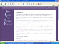
What
came with this release was a drastic departure from prior FP sites. The browns and greens were gone entirely,
replaced by a royal purple. The light blue remained as a highlight.
The layout maintained the navigation-on-the-left layout of
the previous few designs, but cut the menu itself down significantly:
everything was consolidated into five main headings. The main
content of each page was housed in a white table cell that
spanned most of the page's width.
'The
purple site' lasted less than a year. In retrospect, the design
itself was not a bad one, but it didn't match the character of
the series. It always felt somewhat foreign to me and even after
it was released, I continued to tinker with some of the ideas
that had come before the purple concept. Eventually I developed
one sufficiently, and it became the first version of the next
site...
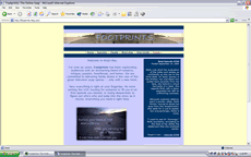
The
original version of that site featured a simpler vertical
layout: the main content of the page in a light blue cell;
darker blue strips, containing a horizontal navigation menu,
on the top and bottom of the main area; and a pale yellow
background. This site also marked the first time that the
"Footprints" poem became part of the series' logo.
Still, I continued to toy with the site, and by late 2003, a revised version of this new design appeared. |
|
|
 |
|
A logo banner,
featuring the same beach-themed photography, topped every
page. While the color scheme remained the same, the yellow
of the background was softened to match the color of the sky
in the banner. The poem remained on the front page, but it
was removed from the logo.
Audience reaction to this yellow-and-blue site was mixed. Though it was praised for its clean, professional appearance, it never seemed to have many fans as an overall look. Back to the drawing board it was |
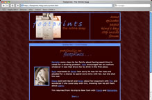
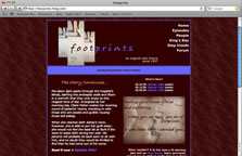
In the fall of 2004, I returned to a previous concept that had never quite worked out. Around Christmas of 2002, I had developed a site with a burgundy, white, and pink color scheme. I posted it as a test for one night only, but the reception was so negative that it was removed before the full site was even posted. My new experiments with this concept turned out much better, and in October 2004--to coincide with the series's seventh anniversary--another era of Footprints began.
With maroon as the dominant color, this site had a much darker look than previous designs. Light blue and orange served as highlights, and the textured background evoked the softness of sand. Images were uniformly sepia-toned with light blue borders.
The reception to this site was overwhelmingly positive, and when the next fall came around, the desire to redesign the site was nonexistant. |
|
 |
 |
|
Three years after the maroon site made its debut, the tenth anniversary of Footprints seemed to call for a visual overhaul. I played with bright sites and dark ones, but my explorations kept leading me back to the existing maroon look. It was only then that it occurred to me that the reason I hadn't felt like redesigning the site in so long was because that look finally felt like FP. After all my efforts to keep it evolving, the series finally had a signature look. That brings us to the tenth anniversary design: a modified version of the original maroon site, with a purplish hue taking the place of the blue and a salmon shade in place of the orange. Things were tweaked, but the concept remained the same. |
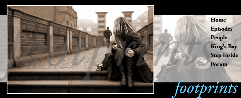
On the occasion of the series' 12th anniversary, it finally seemed like time to freshen FP's look. But I didn't want to stretch too far from what had become a familiar look. After many explorations involving the same color palette, I settled on a design that played upon the existing color scheme and some familiar elements.
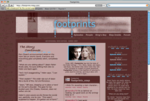
Finally, in the summer of 2011, many elements of the series had begun to feel stale to me. In an effort to reinvigorate the storytelling, I decided to undertake a more dramatic overhaul of the site, which resulted in the current look. The new style allowed me brought a renewed energy to my efforts to rework story plans and make some necessary adjustments.
|
|
|
